

Designing a SMS Login Flow for a Healthcare Portal
Timeline: 3 Weeks
Key Collaborators:
VP of Technology, Lead Data Architect, Product Manager, Offshore development team
How I Made it Happen:

Context & Challenge
Our goal: Enable SMS one-time passcode (OTP) login for a primarily mobile user base in our healthcare portal. This required working around some quirks within our backend database.
The initial flow, proposed by leadership, aimed to work around unreliable phone data. Years of unstructured use of the database, joint family accounts, and no phone number validation meant that existing phone numbers in the database were questionable.
The proposed solution for securely logging in with their phone number required all users logging in to undergo a validation process, requiring they:
Verify themselves through an email OTP first (our only true way to confirm they can access the account)
Provide their phone number (new or old)
Enter a phone OTP (to confirm device possession)
💡 At this point - the user’s phone number is properly “validated” and they can use it to log in.
This was a logical and safe layer of security, but security constraints came with a complex user flow that leadership requested.
Here’s where the UX got weird.
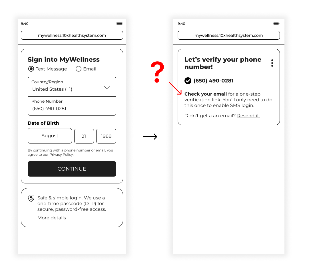
All our users needed to go through this validation process, but our initial login screen asked for a phone number first. So a user could enter their phone number expecting to get a text to their phone, but are instead met with a screen asking them to login through email - as part of this one-time validation.
This risked confusion and even frustration at login.
Multiple One Time Passcodes
Our flow branched in three ways, with varying levels of friction. Ultimately there was concern about two use cases for our one-time validation: phone numbers that we recognize in our database, and phone numbers that we don’t. In both cases, it was tedious for users to enter OTPs for both email and SMS to match our security standards. Many users use the portal for a single task, like signing or receiving documents. Our goal of helping them log in easily was at risk.
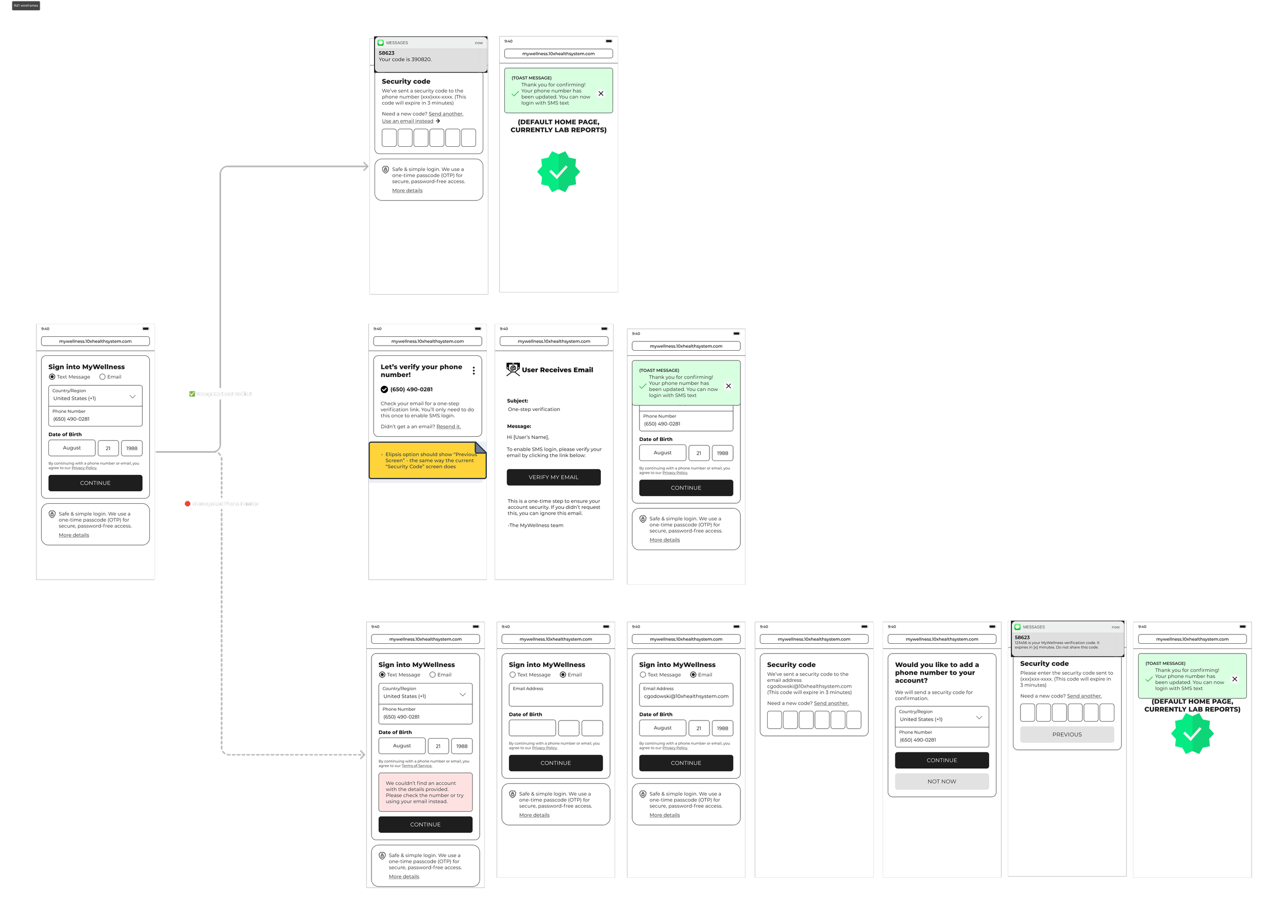
Problematic Flows
Recognized but not verified
Our system recognizes this phone number is attached to an account, but the phone number hasn’t been verified yet.
💡UX Implications - The user must enter the phone number twice in this flow, because we ask for their phone number first, then send them an email with a magic link, and then they must enter in the phone number on this new browser tab where we can not store that data.
The root cause of the redundancy of the user flows is caused by asking users to enter their phone number in first. This results in users being switched back to entering in their email address first for our validation process.
Unrecognized Phone Number
Our system does not recognize the phone number attached to any account.
💡 UX Implications - The user must enter the phone number, resulting in error messaging instructing them to login through email for validation. They will then need to enter in their email OTP, followed by an SMS OTP, resulting in redundancy and confusion. “Why do I need to verify my email address to verify my phone number?”
Validating Concerns & Asking for a Redesign
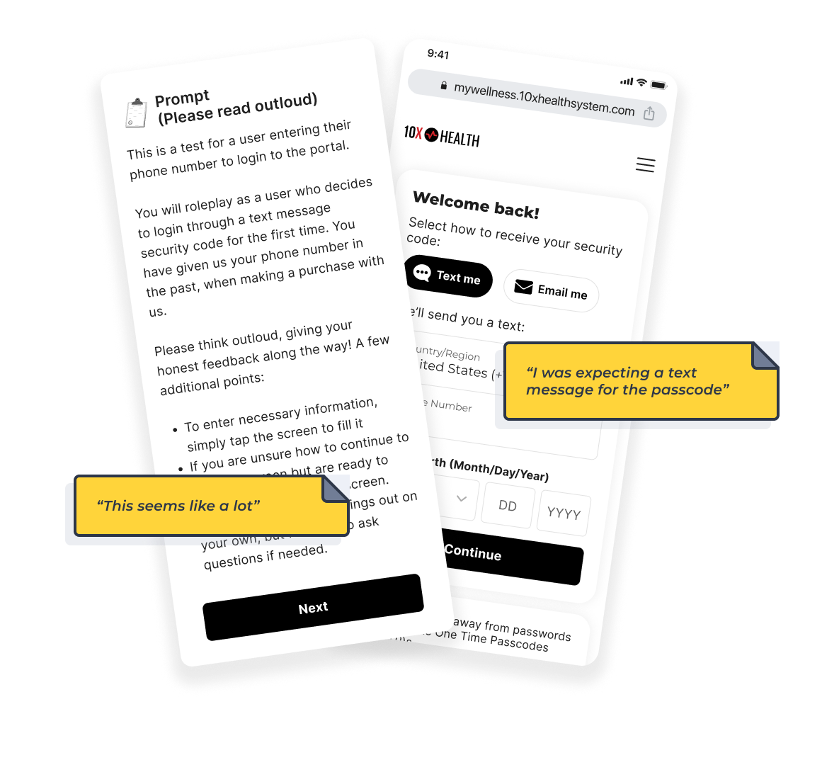
To test concerns and see if this flow was fixable, I prototyped and conducted rapid, moderated tests with 5 participants:
All users were surprised and frustrated by the multiple OTP and email verification steps
Minor adjustments to the screens within the flow did not resolve the core usability issues
Users expected an SMS immediately after entering their phone number, not an email step
The design proposed by the team introduced unnecessary friction and would likely result in user confusion, support tickets, and increased drop-off. To further complicate things, our data architect introduced an additional requirement that would further slow down the user flow. A new user flow was needed to balance security and usability. I discussed the results of this test with our data architect, and presented an alternative design. Although it felt nervewracking to do this in the late stages of a project, he approved.
Solution: Email-First Login with Overlay Module
The alternative user flow was straight forward in concept - instead of a phone number on the login screen, which caused conflict with our security needs, we instead ask for the users email address. When a user enters their email address, if they have a validated phone number on file, they will receive a SMS OTP to their phone. If they don’t have a validated phone number yet, they receive an email OTP to login (which was normal). Once they’ve logged in - we ask them if they would like to add their phone number for an easier and faster login process.
Users may have additional immediate tasks when they log in, like signing our ToS & Privacy Policy, so this flow introduces a progressive overlay module, which allows users to navigate critical tasks on their initial login - including adding their phone number to their account, agreeing to terms, and signing documents in a single linear flow.
Outcome & Impact
The new solution delivered clear, measurable benefits while aligning with both business and technical goals:
Successful launch: July, supporting ~500 daily logins
Zero support tickets related to login usability
User experience: Linear, predictable and enabling a faster login process
Data quality improvement: Users verified and updated phone numbers in the database
Stakeholder alignment: VP of Tech, President, VP of Clinical Ops, VP of Marketing, and other executives fully supported the new flow
Reusable overlay module: Can handle additional post-login tasks like TOS updates and consents, improving efficiency for future projects